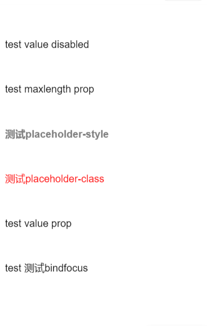
textarea

多行输入框。

效果展示

示例代码

WXML

<view class="page">
<view class="page-section">
<view class="textarea-wrp">
<textarea auto-height />
</view>

<view class="textarea-wrp">
<textarea style="height: 3em" value="test value disabled" disabled />
</view>

<view class="textarea-wrp">
<textarea style="height: 3em" value="test maxlength prop" maxlength="19"/>
</view>

<view class="textarea-wrp">
<textarea style="height: 3em" placeholder="测试placeholder-style" placeholder-style="font-weight:bold"/>
</view>

<view class="textarea-wrp">
<textarea style="height: 3em" placeholder="测试placeholder-class" placeholder-class="customPlaClass"/>
</view>

<view class="textarea-wrp">
<textarea style="height: 3em" value="{{valuePop}}" />
</view>

<view class="textarea-wrp">
<textarea bindfocus="bindFocus" value="test 测试bindfocus"/>
</view>

<view class="textarea-wrp">
<textarea bindblur="bindBlur" value="test 测试bindblur"/>
</view>

<view class="textarea-wrp">
<textarea bindinput="bindInput" value="test 测试bindinput"/>
</view>

<view class="textarea-wrp">
<textarea bindlinechange="bindlinechange" value="test 测试bindlinechange"/>
</view>
</view>

</view>

JS

Page({
data:{
valuePop: 'test value prop',
focusDetail: '',
blurDetail: '',
inputDetail: '',
lineCount: ''
},
bindFocus(e){
this.setData({
focusDetail:JSON.stringify(e.detail)
})
},
bindBlur(e){
this.setData({
blurDetail:JSON.stringify(e.detail)
})
},
bindInput(e){
this.setData({
inputDetail:JSON.stringify(e.detail)
})
},
bindlinechange(e){
this.setData({
lineCount: e.detail.lineCount
})
}
})

WXSS

textarea {
width: 9.33rem;
padding: 25rpx 0;
}

.textarea-wrp {
padding: 0 0.33rem;
background-color: #fff;
}

.page-section{
width: 100%;
margin-bottom: 0.8rem;
}

.page-section:last-child{
margin-bottom: 0;
}

.page-section-title{
font-size: 0.37rem;
color: #999999;
margin-bottom: 0.13rem;
padding-left: 0.39rem;
padding-right: 0.39rem;
}

.customPlaClass{
color: red;
}

API

属性 类型 默认值 必填 说明
value string 输入框的初始内容
placeholder string 输入框为空时占位符
placeholder-style string 指定 placeholder 的样式
placeholder-class string textarea-placeholder 指定 placeholder 的样式类
disabled boolean false 是否禁用
maxlength number 140 最大输入长度,设置为 -1 的时候不限制最大长度
auto-height boolean false 是否自动增高,设置auto-height时,style.height不生效
bindinput eventhandle 键盘输入时触发,event.detail = {value, cursor}
bindfocus eventhandle 输入框聚焦时触发,event.detail = {value }
bindblur eventhandle 输入框失去焦点时触发,event.detail = {value, cursor}
bindlinechange eventhandle 输入框行数变化时调用,event.detail = {lineCount }

多平台支持

属性 平台支持
value 支付宝
placeholder 支付宝
placeholder-style 支付宝
placeholder-class 支付宝
disabled 支付宝
maxlength 支付宝
auto-height 支付宝
bindinput 支付宝
bindfocus 支付宝
bindblur 支付宝
bindlinechange