进度条。
效果展示
示例代码
WXML
<view class="page">
<view class="page__hd">
<text class="page__title">progress</text>
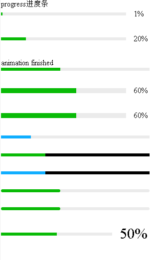
<text class="page__desc">进度条</text>
</view>
<view class="page__bd">
<view class="section section_gap">
<progress show-info/>
<progress percent="-10" show-info />
<progress percent="0" show-info />
<progress percent="1" show-info />
<progress percent="20" show-info="{{true}}" />
<view>{{res}}</view>
<progress percent="40" active bindactiveend="bindactiveend" duration="100" />
<progress percent="60" stroke-width="10" show-info />
<progress percent="60" stroke-width="{{strokeWidth}}" show-info />
<progress percent="20" activeColor="#10AEFF" />
<progress percent="30" backgroundColor="#000000" />
<progress percent="30" activeColor="#10AEFF" backgroundColor="#000000" />
<progress percent="40" border-radius="20" show-info="{{false}}" />
<progress percent="40" border-radius="{{borderRadius}}" show-info="{{false}}" />
<progress percent="50" show-info="{{true}}" font-size="30" />
<progress percent="50" show-info="{{true}}" font-size="{{30}}" />
<progress percent="50" show-info="{{true}}" font-size="{{fontSize}}" />
<progress percent="100" show-info />
<progress percent="200" show-info />
</view>
</view>
</view>
|
JS
Page({
    data: {
        res: 'res',
        borderRadius: 20,
        fontSize: 30,
        strokeWidth: 10
    },
    bindactiveend:function(){
        console.log("动画执行完了");
        this.setData({
            res: 'animation finished'
        })
    }
})
|
WXSS
progress{
    margin-bottom: 30px;
}
|
API
| 属性 |
类型 |
默认值 |
必填 |
说明 |
| percent |
number |
|
否 |
百分比0~100 |
| show-info |
boolean |
false |
否 |
在进度条右侧显示百分比 |
| border-radius |
number/string |
0 |
否 |
圆角大小 |
| font-size |
number/string |
16 |
否 |
右侧百分比字体大小 |
| stroke-width |
number/string |
6 |
否 |
进度条线的宽度 |
| activeColor |
string |
#09BB07 |
否 |
已选择的进度条的颜色 |
| backgroundColor |
string |
#EBEBEB |
否 |
未选择的进度条的颜色 |
| active |
boolean |
false |
否 |
进度条从左往右的动画 |
| duration |
number |
30 |
否 |
进度增加1%所需毫秒数 |
| bindactiveend |
eventhandle |
|
否 |
动画完成事件 |
多平台支持
| 属性 |
平台支持 |
| percent |
支付宝 |
| show-info |
支付宝 |
| border-radius |
|
| font-size |
|
| stroke-width |
支付宝 |
| activeColor |
支付宝 |
| backgroundColor |
支付宝 |
| bindactiveend |
|
| duration |
|
| active |
支付宝 |
注释:
支付宝percent属性在非区间[0-100]内的展示效果不一致,无percent参数展示效果不一致