<template>
<div class="lc-demo">
<title title="lc-swipe-cell"></title>
<div>
<scroller>
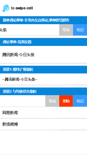
<category title="简单滑动菜单-手势向左边滑动,菜单按钮操作"></category>
<lc-swipe-cell @actionClick="clickmenu"
@swipeleft="swipeleft"
@swiperight="swiperight"
:items="btnAry1"
:title="'腾讯新闻-今日头条'"></lc-swipe-cell>
<category title="滑动菜单-高度设置"></category>
<lc-swipe-cell @actionClick="clickmenu"
:height="'150px'"
:items="btnAry1"
:title="'腾讯新闻-今日头条'"></lc-swipe-cell>
<category title="场景1-组件扩展案例"></category>
<lc-swipe-cell :items="btnAry1"
:title="'腾讯新闻-今日头条'"
@wrapClick="fn">
<text slot="content">--腾讯新闻-今日头条--</text>
</lc-swipe-cell>
<category title="场景2-与列表结合案例"></category>
<div v-for="(i, index) in items" :key="index">
<lc-swipe-cell :index="index" :hasArrow="true" :items="btnAry" :title="i.title" @actionClick="clickmenu1"></lc-swipe-cell>
</div>
</scroller>
</div>
</div>
</template>
<script>
import Light from 'light';
import Title from 'lighting-ui/packages/_mods/title.vue';
import Category from 'lighting-ui/packages/_mods/category.vue';
import LcSwipeCell from 'lighting-ui/packages/lc-swipe-cell';
var animation = Light.requireModule('animation');
var modal = Light.requireModule('modal')
export default {
components: { Title, Category, LcSwipeCell },
data() {
return {
btnAry1: [
{
'title': '取消',
'bgcolor' : '#c6c7c8'
},
{
'title': '标记',
'bgcolor' : '#3399ff'
}
],
btnAry: [
{
'title': '取消',
'bgcolor' : '#c6c7c8'
},
{
'title': '删除',
'bgcolor' : '#fa3300'
},
{
'title': '标记',
'bgcolor' : '#3399ff'
}
],
items: [
{
'title':'腾讯新闻'
},
{
'title':'网易新闻'
},
{
'title':'新浪微博'
}
]
}
},
methods: {
fn(){
modal.toast({message: "点击click",duration: 0.5})
},
clickmenu(e){
if(e == 0){
modal.toast({message: this.btnAry1[e-0].title,duration: 0.5})
}else if(e == 1){
modal.toast({message: this.btnAry1[e-0].title,duration: 0.5})
}
},
clickmenu1(e,i){
if(e == 0){
modal.toast({message: i+this.btnAry[e-0].title,duration: 0.5})
}else if(e == 1){
modal.toast({message: i+this.btnAry[e-0].title,duration: 0.5})
}
else if(e == 2){
modal.toast({message: i+this.btnAry[e-0].title,duration: 0.5})
}
},
swipeleft(){
modal.toast({message: '左滑了',duration: 0.5})
},
swiperight(){
modal.toast({message: '右滑了',duration: 0.5})
}
}
}
</script>
<style scoped>
</style>
|