输入框组件,支持 8 种基本类型,可自定义样式
效果
使用方法
<template>
<div class="lc-demo">
<scroller class="scroller">
<title title="lc-input"></title>
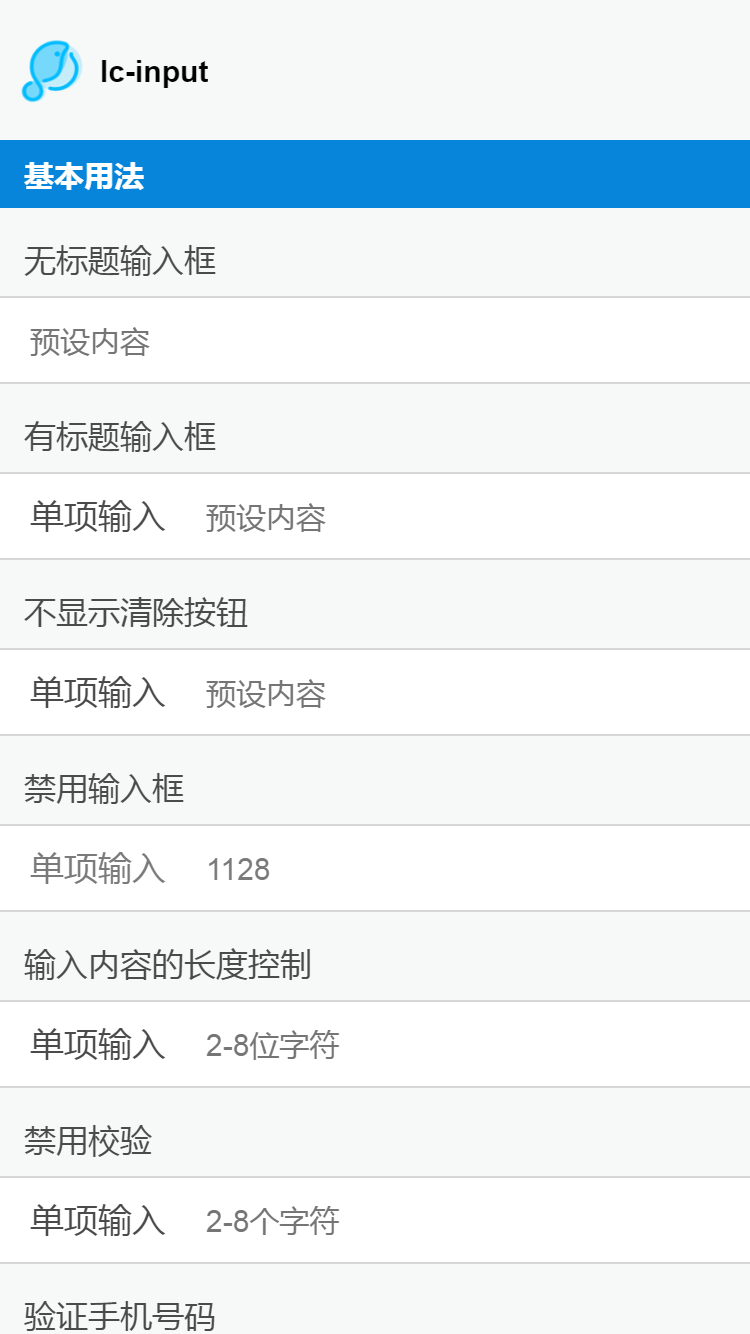
<category title="基本用法"></category>
<text class="hint">无标题输入框{{password1}}</text>
<lc-input placeholder="预设内容" :has-top-border="false" :has-bottom-border="false" cell-index="last" @onChange="onEvent('change')" v-model="password1"></lc-input>
<text class="hint">有标题输入框</text>
<lc-input label="单项输入" placeholder="预设内容"></lc-input>
<text class="hint">不显示清除按钮</text>
<lc-input label="单项输入" placeholder="预设内容" :show-clear="false"></lc-input>
<text class="hint">禁用输入框</text>
<lc-input label="单项输入" :disabled="true" v-model="inputValue"></lc-input>
<text class="hint">输入内容的长度控制</text>
<lc-input label="单项输入" :min="2" :max="8" placeholder='2-8位字符'></lc-input>
<text class="hint">禁用校验</text>
<lc-input label="单项输入" placeholder='2-8个字符' :min="2" :max="8" :novalidate="true"></lc-input>
<text class="hint">验证手机号码</text>
<lc-input label="手机号码" placeholder="请输入手机号码" is-type="china-mobile"></lc-input>
<text class="hint">验证邮箱</text>
<lc-input label="邮箱" placeholder="请输入邮箱地址" is-type="email" ></lc-input>
<text class="hint">自定义校验规则</text>
<lc-input label="必须输入2333" label-width="240px" :is-type="be2333" placeholder="预设内容"></lc-input>
<text class="hint">确认输入</text>
<lc-input label="密码" type="password" placeholder="请输入6位密码" :min="6" :max="6" v-model="password1" @onInput="onEvent('change')" :has-bottom-border="false"></lc-input>
<lc-input label="确认密码" type="password" v-model="password2" placeholder="请确认密码" :equal-with="password1" :has-top-border="false"></lc-input>
<text class="hint">验证码</text>
<div>
<lc-input label="手机号码" label-width="160px" placeholder="输入手机号码" :has-bottom-border="false" :cell-style="cellStyle">
<text slot="right" class="text-btn">获取验证码</text>
</lc-input>
<lc-input label="验证码" label-width="160px" placeholder="输入验证码" :has-top-border="false" :has-bottom-border="false"></lc-input>
<lc-input label="密码" label-width="160px" type="password" placeholder="输入密码" :has-top-border="false"></lc-input>
</div>
<text class="hint">必填项</text>
<lc-input label="必填" placeholder="预设内容" v-model="input01" :required="true"></lc-input>
<text class="hint">非必填项</text>
<lc-input label="非必填" placeholder="预设内容" :required="false" v-model="input02"></lc-input>
<category title="自定义样式"></category>
<text class="hint">label-width & label-align</text>
<lc-input label="单项输入" label-width="180px" label-align="right" placeholder="预设内容"></lc-input>
<text class="hint">label-color</text>
<lc-input label="单项输入" label-color="#0785DB" placeholder="预设内容"></lc-input>
<category title="事件"></category>
<text class="hint">focus事件</text>
<lc-input label="单项输入" placeholder="预设内容" @onFocus="onEvent('focus')"></lc-input>
<text class="hint">blur事件</text>
<lc-input label="单项输入" placeholder="预设内容" @onBlur="onEvent('blur')"></lc-input>
<text class="hint">enter事件</text>
<lc-input label="单项输入" placeholder="输入完成后回车" v-model="enterText" @onEnter="onEvent('enter')"></lc-input>
<text class="hint">input事件</text>
<lc-input label="单项输入" @onInput="onEvent('input')" placeholder="预设内容"></lc-input>
<text class="hint">change事件</text>
<div style="margin-bottom: 40px;">
<lc-input label="单项输入" @onChange="onEvent('change')" placeholder="预设内容"></lc-input>
</div>
</scroller>
</div>
</template>
<style scoped>
.lc-demo {
position: absolute;
top: 0;
bottom: 0;
left: 0;
right: 0;
background-color: #F6F9F8;
}
.scroller {
flex: 1;
}
.hint {
margin-top: 30px;
margin-bottom: 16px;
padding-left: 24px;
font-size: 32px;
color: #4A4A4A;
}
.text-btn {
font-size: 34px;
color: #0785DB;
letter-spacing: 0.25px;
line-height: 78px;
height: 78px;
padding-left: 30px;
border-left-style: solid;
border-left-width: 1px;
border-left-color: #D7D7D7;
}
</style>
<script>
import Light from "light"
const modal = Light.requireModule('modal');
import Title from 'lighting-ui/packages/_mods/title.vue';
import Category from 'lighting-ui/packages/_mods/category.vue';
import LcInput from 'lighting-ui/packages/lc-input';
export default {
components: { Title, Category, LcInput },
data: () => ({
value: '',
showCancel: true,
isDisabled: true,
iconType: '',
inputValue: '1128',
maxValue: '3',
enterText: 'enter me',
style: '',
password1: '222',
password2: '',
input01: '',
input02: '',
be2333: function (value) {
return {
valid: value==='2333',
msg: 'Must be 2333'
}
},
cellStyle: {
height: '80px'
}
}),
methods: {
onEvent(e) {
modal.toast({
message: e
})
console.log(this.password1);
}
},
watch: {
"password1": function(val) {
console.log(val);
}
}
};
</script>
|
可配置参数
| Prop |
Type |
Required |
Default |
Description |
| label |
String |
N |
- |
标签 |
| type |
String |
N |
text |
类型(注1) |
| placeholder |
String |
N |
- |
占位符 |
| value |
String,Number |
Y |
- |
输入框的值,可以为字符串或数字 |
| disabled |
Boolean |
N |
- |
是否禁用 |
| autofocus |
Boolean |
N |
false |
是否自动获取焦点 |
| novalidate |
Boolean |
N |
false |
是否禁用校验 |
| is-type |
String,Function |
N |
- |
内置验证器(注2) |
| required |
Boolean |
N |
false |
是否必填 |
| min |
String,Number |
N |
- |
输入内容的最小长度,类型为Number。当 type 属性为 date 时选择日期的最小时间,格式为 yyyy-MM-dd,类型为string。(注3) |
| max |
String,Number |
N |
- |
输入内容的最大长度,类型为Number。 当 type 属性为 date 时选择日期的最大时间,格式为 yyyy-MM-dd,类型为string。(注3) |
| equal-with |
String |
N |
- |
确认输入的参考值 |
| show-clear |
Boolean |
N |
true |
是否显示清除按钮 |
| label-align |
String |
N |
- |
标签文字对齐方式left/center/right |
| label-width |
String |
N |
- |
标签的宽度 |
| label-color |
String |
N |
#4A4A4A |
标签文字颜色 |
| has-top-border |
Boolean |
N |
true |
是否有上边框 |
| has-bottom-border |
Boolean |
N |
true |
是否有下边框 |
| cell-style |
Object |
N |
- |
输入框的样式 |
| cell-index |
String |
N |
- |
用于多个输入框的情况下,输入框的索引值 |
| title-style |
Object |
N |
{marginRight:'0'} |
可输入区域的样式(不包括input输入框) |
| input-style |
Object |
N |
|
input输入框的样式 |
注1:支持类型text/number/email/url/tel/password/date/time
注2:支持email,china-mobile, 同样也支持直接传函数, 需要同步返回一个对象{valid:true}或者{valid:false, msg:错误信息}
注3:ios的H5因系统关系,type设为date时不支持max和min这两个属性