<template>
<div style="background:#f6f6f6">
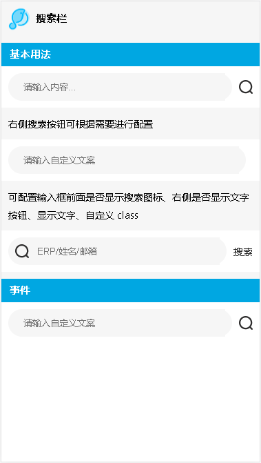
<lc-title title="搜索栏"></lc-title>
<category title="基本用法"></category>
<div class="demo1">
<lc-searchbar></lc-searchbar>
</div>
<p>右侧搜索按钮可根据需要进行配置</p>
<div class="demo1">
<lc-searchbar
placeText="请输入自定义文案"
:hasSearchButton="false"
></lc-searchbar>
</div>
<p>可配置输入框前面是否显示搜索图标、右侧是否显示文字按钮、显示文字、自定义 class</p>
<div class="demo1">
<lc-searchbar
placeText="ERP/姓名/邮箱"
:hasIcon="true"
:hasTextButton="true"
customClass="search_demo"
></lc-searchbar>
</div>
<category title="事件"></category>
<div class="demo1">
<lc-searchbar
placeText="请输入自定义文案"
@focus="focusFun"
@input="inputFun"
@blur="blurFun"
@submit="submitFun"
></lc-searchbar>
</div>
</div>
</template>
<script>
import LcTitle from '_mods/title.vue';
import Category from '_mods/category.vue';
export default {
components: { LcTitle, Category },
methods:{
focusFun() {
console.log('获取焦点操作!');
},
inputFun(value) {
console.log(value);
console.log('您正在输入...');
},
blurFun(value) {
console.log(value);
console.log('您已失去焦点!');
},
submitFun(value) {
console.log(value);
console.log('默认提交操作!');
}
}
}
</script>
<style lang="less" scoped>
.demo1 {
padding: 10px;
background: #fff;
}
p{ line-height: 26px; padding:10px; font-size: 14px;}
</style>
|